|
|
Picture Perfect Flowers
9/23/2012
 | Color is Everything! More important than variety, style or even design, color most affects the overall appearance of your wedding. Color preference is uniquely personal. When you ‘like’ or ‘dislike’ a bouquet or design, you are usually reacting to the color first. | Time of Day. The available light effects the perception of color. More intense light allows bright, vivid colors to show brilliantly. It also allows colors from the ‘cool’ side of the color spectrum to be seen more easily – hues of blue, purple, lavender and green. For daytime ceremonies and receptions (providing they are outdoors or there are windows at the location) the only limit to color is your imagination! Do keep in mind that polychromatic (mixed) color schemes, especially those that include intense yellows, can give your wedding pictures a more ‘busy’ look. Yellows, especially, have the character of color to dominate any design into which they are placed, no matter how small the blossoms.
| For evening ceremonies and receptions or dark churches and synagogues, there will be less ambient light. Showing best are whites, ivories and colors from the ‘warm’ side of the color spectrum – hues of reds, pinks, yellows, peaches and oranges. The ‘cool’ colors recede with low light and can be very difficult to see and/or photograph. Dark blues and purples look black, light blues and lavenders fade to grey. (Think of how dresses in these colors appear at night.) Designs with ‘cool’ colors can be lightened with the introduction of flowers in chartreuse, ivory or white or the addition of metallic accents in gold, platinum or copper. In low light, we suggest you avoid dense statements of ‘cool’ colors unless your budget permits for pin-spotting individual areas and dining tables.
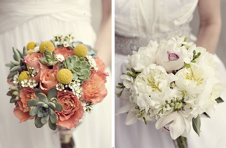
| Color Value. The intensity of colors also greatly effects the overall perception of your designs. Bouquets of one type of flowers matching your gowns and settings give a simple, clean appearance. Intensely colored bouquets mixed with pale colored gowns or settings provide dramatic looks for maximum contrast. When choosing personal flowers (bouquets, corsages, boutonnieres) always remember that they will be photographed in the context of people with fashions - not just by themselves.
| Bouquets that contain highly contrasting colors within themselves can provide a challenge to photographers. Values far apart – such as red and white – can appear polka-dot- like – especially of the blossoms are all similarly sized. To reduce this effect, we suggest you consider blossoms of varying sizes (allowing one color to dominate) and/or the introduction of additional, related color or colors. To red and white, you might add pinks (the color achieved by mixing red and white.)
| | Textures Matter. The textures of your flowers and accessories will have an important impact on the overall appearance of your photographs. As with color, choosing textures that match or are closely related to those of your gowns and settings will give a coordinated, unified look. Do keep in mind, however, that too much of a match can make the bouquets blend into the fashions, making photography a challenge. | High sheen gowns (polished silks, satin's) coordinate well with flowers and styles that have a cleaner, more polished appearance. Theses fabrics have a visual complexity due to their reflective qualities. Consider choosing medium to large-size blossoms and limit the quantity of busier, smaller flowers for an elegant, uncluttered look. Clean, simple gowns provide an incredible palette onto which artistic, highly detailed and texturally complex bouquets can be featured. Avante Gardens generally recommends you avoid flowers and foliages with a high gloss – unless you wish to create a contemporary, avant garde feel. The gloss reflects light and can distort the color of the materials - turning foliages shades darker in the photographs.
| | Fascinating Rhythms. Rhythm is defined as the relationship of flowers and foliages - their correlated intervals - to one another in a particular design and to each other in a group of designs. Traditional bouquets consist of steady rhythmic patterns. Contemporary bouquets use more ‘syncopated,’ asymmetric rhythms to create interest. Regardless of the rhythm of your chosen style, the designs should always be rhythmically consistent. | Too much space between flowers in a traditional bouquet gives an empty, incomplete appearance that will be magnified in the photographs. Too much space between individual flower arrangements can also create an empty, incomplete look. Try decreasing the overall size of a design for a more rhythmically consistent appearance or consider grouping designs more closely together to give a stronger visual impact. Please inform your professional consultant of any particular photo areas or settings we can help make more photogenic and memorable.
| Oliver Thorne's Flower Design Experts have lots of advice for you about flowers, colors and styles that will photograph well for your specific wedding or event. To truly ensure perfect pictures, make certain to choose an experienced, professional photographer and let him or her know what kinds and styles of wedding photos are most important to you. For more information and to discuss the decor for your event, please email events@oliverthorne.com or call 858-735-6435 |
|